PIN Security Fun
So I was idly wondering about the security of a user-selected four digit PIN I have recently come to be in charge of.
In the scheme of things there aren’t many four digit PINs. The space is very small, at only 10000, so I wanted to find a league table of PINs from most commonly to least commonly used. Looking things up, I found an interesting article on the subject.
NB - This post modified from a series of posts I made to Mastodon three weeks ago…
So the article is here.
The full research, by data scientist Nick Berry1, is here.
Berry claims to have a large dataset showing how commonly each four digit PIN is used. Sensibly, he is very clear that he will not release this data:
… do not email me asking for the database I used; if you do, you will be wasting your time as I’m not going to respond. I’m not going to sell, donate or release the source data
Also Berry:
I love pretty ways to graphically vizualize data. Pictures really do paint thousands of words.
He continues:
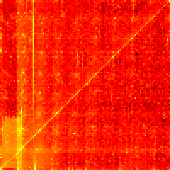
Another interesting way to visualize the PIN data is in this grid plot of the distribution. In this heatmap, the x-axis depicts the left two digits from [00] to [99] and the y-axis depicts the right two digits from [00] to [99]. The bottom left is 0000 and the top right is 9999.

CHALLENGE ACCEPTED.
To explain if not already clear: Berry has emphasised that he has no intention of releasing his PIN usage data, but by providing a heatmap based on it, he effectively has, at least for the part I am interested in. All that is required is to decode the heatmap. The whole dataset is still out of reach, but the full league table of PIN numbers is entirely encoded in the heatmap.
Long story short, I spent a happy evening writing this Ruby code.
It takes the provided heatmap image of the entire four digit PIN space (broadly speaking brighter is more widely used, darker less) and - very clunkily and slowly - this is not My Best Code - extracts the hex colour value, using the ImageMagick library, pixel by pixel, and matches it to the corresponding PIN.
Simply sorting the resulting output by raw hex value absolutely should not work. With a sensibly generated heatmap, why would it? There ought to be more steps to my solution than this. However, as it happens in this case, I think it basically does. Our top 20 and bottom 20 PINs are the pretty much the same as those listed in the article, except for a few that swap position due to loss of precision.
Is it possible that a heatmap decoded and sorted this way could preserve the top and bottom 20 elements of the list while effectivly yielding garbage in the rest of it? Perhaps it is? But if the colour values for the heatmap were chosen so as to obscure their exact origin, why preserve the forty most important items in the list? Even if accuracy gradually degrades with proximity to the middle of the list (that would seem fair) it seems like this data extract is still enough to get a vague idea of where in the overall table of PIN popularity a given PIN might sit. After all, I don’t need 100% accuracy. I just want to know if the PIN I have chosen is Demonstrably Stupid or not.
So. While I have not reconstructed the exact ordering of the 10000 possible 4-digit PINs in terms of popularity, it looks like I have managed to create a list that is close enough to the original to be of some use - this is to say: the ranking of the PIN in the output is likely to be fairly close to the ranking in the original data.
If you grab the image above and run my code against it, you can verify this for yourself.
My original Mastodon thread asked Should I go ahead and register / build ratemypin.com? which was a whimsical but admittedly massively dumb idea. I will be doing nothing of the sort.
1 - Sadly Nick Berry passed away last year. RIP, Nick. I would have loved to have discussed this with you.